Figure 1 & 2
Throughout our lives, we have been encouraged to make a great first impression: with the teacher, the coach, the employer, the (future) parents-in-law, and now…every patient. So, besides our personal appearance, communication skills, and those of our staff, how do we collectively “put our best foot forward”? By greeting the new patient with a great office.
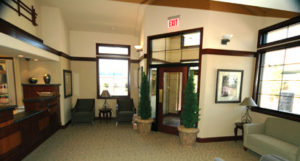
Figure 3
Of course, this begs the question, what are the components of a great office and what does it look like? Read on.
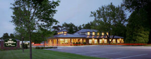
The first contact your new patient has with the office is viewing its signage. It should reflect the quality of care you are providing in the office and be legible and visible from the road. Character font, color, verbiage, and sign materials will all be part of the message about the quality of care delivered in your practice. Be sure to illuminate the sign with quality lighting for night traffic and for early morning patients, especially if you are in the north. A quality sign can be expensive today, so be prepared to spend $10,000 to $20,000 for a great sign (see fig. 1).
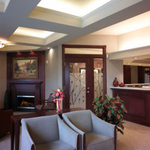
Figure 4
The exterior of your building will also make an initial statement to the new patient. The materials and color composing the building, lighting, roof line, facility name, as well as the parking lot condition and ground maintenance all contribute to the mosaic being built in patients’ minds as they approach the entrance to your office (see fig. 2).
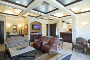
Figure 5
As patients enter the front door, it should be glass or have a glass insert so they can see the space they are entering (see fig. 3).
In fact, this principle should be carried throughout the office to alleviate subliminal anxiety in new patients as they move from space to space in the office. For example, the door from the waiting room to the trunk hallway leading to the clinical area should be glass or have a glass insert (see fig. 4).
The waiting room should be large enough to accommodate 1.5 chairs per operatory for adequate seating, and the seats should be arranged to give patients that critical personal space we all require; no one likes a “close-talker” because they invade personal space and make a conversation uncomfortable. The same principle applies to seating. It is desirable to employ some level of ceiling architecture with soffits or coffers in the waiting room, if possible, with an associated lighting plan (see fig. 5).
Purposeful lighting will draw the patient’s eye to desired features and set a tone for the office. If you want to see the power of lighting in creating an ambience in a space, walk into a Starbucks® coffee shop and consciously consider the created experience. Then, look at the ceiling; the purposeful lighting creates a wonderful, calming and inviting experience.
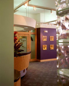
Figure 7
The furniture, as well as the wall coverings and flooring, makes a very direct statement to the patient as they sit in the waiting room. It is strongly recommended that commercial grade materials are employed in the furniture for superior wearing qualities and that medical grade carpet be used to prevent any staining (solution dyed nylon will not stain) (see fig. 6).
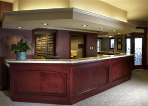
Figure 8
The reception desk should be very obvious as the new patient enters the waiting room and should be within 5 to 7 steps of the vestibule or front door. The materials used are very important in making a statement to the patient and should be of quality (see fig. 7). The appointment desk will be a continuation of the reception desk and should have a countertop that’s 44 inches from the floor so patients can comfortably sign checks or credit card receipts. There is a definite relationship between the size of reception and appointment desk for optimal efficiencies: the appointment desk should be two to three times as long as the reception desk (see fig. 8).
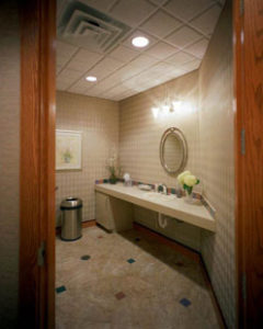
Figure 9
What do Disneyland®, Starbucks®, McDonald’s®, and your practice have in common? The answer will surprise you: the need for updated and clean bathrooms. All of the mentioned companies train their new managers that the most important issue for their guests is restroom cleanliness! It is not the food, coffee, wait times, or quality of the ride, but the restrooms! Mom will not return if the restroom is dirty or old. Taking this to heart, create quality restroom environments with lighting, some art, and pleasing materials (see fig. 9). And place the patient restroom entrance in full view of the appointment desk and front desk staff so they can monitor who enters and exits, periodically checking the restroom to clean it.
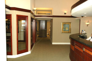
Figure 10
The most important room of the entire office for production is the consultation room. It is the space in which the case presentation is made and the patient accepts the treatment plan. The national case acceptance rate is about 45%, but if you create an office and consult room consistent with the parameters in this series of articles, your case acceptance rate can rise to over 80%. That has been our experience in creating these principles of dental office design.
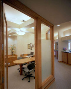
Figure 11
The consult room is a buffer room between the purely public areas and the purely clinical area of the office (see fig. 10) and should be a minimum of 9’ x 9’ with an eight-foot ceiling to be effective. It can have a built-in desk with a varying amount of technology, but it should exactly communicate the level of care proposed to the patient because the patient did not attend dental school and cannot evaluate the level of care you are proposing (see fig. 11). They are extrapolating the quality of the consult room and office to the quality of care you will provide. When you design your office strategically, giving careful thought to core design principles, it not only builds morale and puts patients at ease, but it can also help boost your bottom line. Plan your space with an equal emphasis on aesthetics, image, and production for the most successful result.
This article was originally published in Sidekick Magazine.
About the Author:
Dr. Mark Tholen graduated from the University of Texas Dental School and U.T. Graduate School of Business with an MBA. He served in the U.S. Air Force and was engaged in practice before turning his attention to industry. He is the former CEO of T.H.E. Design, a dental and medical office design firm and author of the book, A Guide to Designing the Elegant Dental Office…The Largest Marketing Tool of Your Career, available at Amazon.com. He can be reached at dr.mark@tholenconsultants.com or (972) 365- 6151. Dr. Tholen lectures throughout the U.S. and Canada frequently and is engaged in the active design of dental offices with Tholen Consultants of Austin, Texas.